Design intelligence
The product is designed, not assembled. Architecture, materials, and site planning are the substance of the claim.

Brand Guide — Version 1.010
AMARI Tulum develops design-led jungle villas built to a single design, build, and operating standard. This guide sets the palette, typography, and voice that carry that feeling across every surface.
If a paragraph does not reinforce one of these, it does not belong in AMARI copy.
The product is designed, not assembled. Architecture, materials, and site planning are the substance of the claim.
AMARI runs the asset. Systems, SOPs, staffing, and NOI discipline are part of what investors and guests are buying.
Design, build, operate, brokerage. One team carries the villa from first sketch to resale, so the experience never changes hands.
The villas are built for how it feels to live there and what it is worth over time. The feeling and the value grow together.
AMARI sells an experience: the jungle, the light, the sense of arriving somewhere rare. The voice is warm and evocative first, grounded in real numbers wherever proof matters.
We speak like hosts. Investors are family, guests are guests of the house, and the copy is allowed to say so.
Sensory, experiential language is on-brand. Paint the morning, the canopy, the quiet. Superlatives are welcome when they are true.
A luxury register: graceful and unhurried. Confidence without pressure. Never loud, never desperate.
The feeling is credible because the operation is real. Numbers, systems, and specifics stand behind every promise.
How AMARI copy works
An unparalleled luxury experience in the heart of the Yucatan jungle.
46 villas built on a single design, build, and operating standard, so the experience holds on every stay.
We treat our investors like family.
Investor updates arrive the first Tuesday of every month, in the same format, whether the news is good or bad.
Mornings begin under the canopy: birdsong, coffee on the deck, a private pool warming in the first light.
Each villa is 2,400 square feet, three bedrooms, with a private plunge pool and on-site staff.
A place that feels like it was always waiting for you.
Occupancy is running at 75%, well above market. The feeling is working.
What we still avoid
Pressure tactics: countdown urgency, "don't miss out", "limited spots". Corporate buzzwords: synergies, ecosystems, leverage plays. Discount-brand energy: all-caps hype, stacked punctuation, emoji walls. Warmth is the register. Desperation never is.
Two brands sit in the system: AMARI Tulum is the house brand; AMARI Uptown is the first project. Both share the brushed A-frame mark and the serif wordmark set over a spaced descriptor.


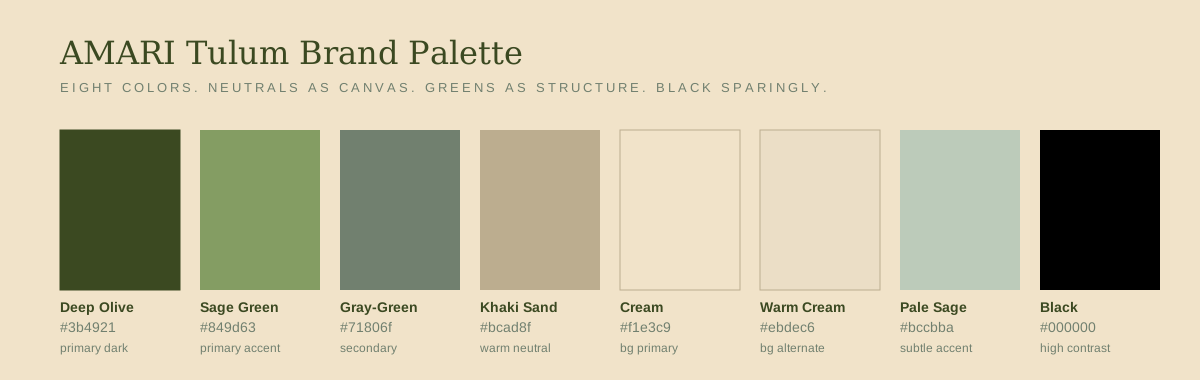
Neutrals are the canvas. Greens are the structure. Black earns emphasis only when it is unavoidable. Pure white is not in the palette.
Tested pairings
Default surface
Cream ground, olive text, sage accent.
#F1E3C9 · #3B4921 · #849D63
Dramatic surface
Olive ground, cream text, khaki accent.
#3B4921 · #F1E3C9 · #BCAD8F
Editorial surface
Khaki ground, olive text, black rule.
#BCAD8F · #3B4921 · #000000
Accessibility
| Foreground on background | Ratio | Body text | Large text |
|---|---|---|---|
| Olive on Cream | 9.7 : 1 | Pass | Pass |
| Cream on Olive | 9.7 : 1 | Pass | Pass |
| Black on Cream | 14.4 : 1 | Pass | Pass |
| Sage on Cream | 2.6 : 1 | Fill only | Fill only |
| Gray-Green on Cream | 3.6 : 1 | Fail | Large only |
| Khaki on Olive | 4.4 : 1 | Borderline | Pass |
| Blue Eucalyptus on Olive | 8.4 : 1 | Pass | Pass |
When in doubt, default to olive on cream or cream on olive.
Fraunces for display, Montserrat for headers and labels, DM Sans for body. All three are open-source, so the same fonts render on the web, in decks, in documents, and in print. No licensed substitutions, no drift between surfaces.
Amari
Forty-six villas. One operating standard.
AMARI is a portfolio of design-led jungle villas in Tulum, designed, built, and operated by one team. The first project is AMARI Uptown. The mandate is to deliver a repeatable product at scale, without the boutique-per-lot inefficiencies that have defined the market to date.
Scale reference — web
Rules that hold
letter-spacing: 0.12em to 0.2em. Nothing looser.Buttons, data callouts, pull quotes, and the small pieces that carry the brand into product and deck surfaces.
Olive primary, sage on hover. Ghost variant reverses to olive fill.
Radius 2px. Uppercase, tracked +0.14em. No drop shadows.
You do not leave the jungle. It stays with you.
Guest note, Villa 12, March 2026Operating Model
Vertically integrated by design.
Olive, sage, khaki, gray-green, blue eucalyptus, black. Extend with tints, never new hues.
Machine-readable tokens, palette references, and the official logo files. This guide is the source of truth for the AMARI brand. Production media lives in the two libraries below.
Unedited photography and footage for production work.
Media libraryEdited, approved assets ready for external use.
 PNG · 4500px
Full lockup, black on transparent.
 PNG · 4500px
White on transparent, for dark surfaces.
 PNG · 1400px
First project lockup, black on transparent.
 PNG · 1200px
White on transparent, for dark surfaces.
 PNG · 4500px
No mark, black on transparent.
 PNG · 4500px
No mark, white on transparent, for dark surfaces.